Editor’s note: Robert Kosara is a speaker for ODSC East this April 23-25. Be sure to check out his talk, “A Practical Introduction to Data Visualization for Data Scientists,” there!
There are many ways to create visualizations, between chart choosers, chart wizards, GUI-based tools of various flavors, and of course, many libraries if you’re looking to use code. Many of the latter describe themselves as grammars or grammar-based. But what does that mean?
Just like we build sentences from components (words) following rules (grammar), visualization grammar allows you to compose complex visualizations from relatively simple building blocks. In visualization, components include mappings that translate a data value into a location, size, or color, or computations that calculate a percentage, minimum, maximum, etc. Rules are ways to combine them, to scale a chart, or combine computations and mappings to create a stacked bar chart, etc.
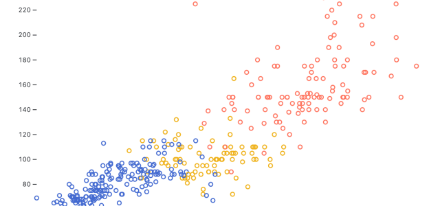
Here’s an example using Observable Plot, a grammar-based JavaScript library for exploratory data visualization. First, let’s draw a scatterplot of horsepower versus weight using a subset of the infamous cars dataset.
Plot.dot(cars, {x: "weight (lb)", y: "power (hp)", stroke: "cylinders"})
This is just the key part of the definition, but you can see how it maps the weight column to the x dimension, power to y, and the number of cylinders to the stroke color. Using the Plot.dot() function, we get a circle (with no fill in this case). This creates a scatterplot, which in a way is the simplest chart type out there because it only consists of simple mappings without the need for any real computation or other composition of components.

What if we wanted a histogram instead? That requires us to compose two functions, one that computes the bins along the x axis, called binX(), and one that draws vertical rectangles, rectY(). We map weight to x as before, but now we put the count of rows on the vertical dimensions. We’re also specifying the fill color as a constant:
Plot.rectY(cars, Plot.binX({y: "count"}, {x: "weight (lb)", fill: "steelblue"}))

What if we want to see the distributions for cars with different numbers of cylinders? We can create what’s called a faceted chart by specifying the faceting dimension using the fy property (for vertical facets). We’ll also change our fill color to use the number of cylinders again (like in the scatterplot), and voilà:
Plot.rectY(cars, Plot.binX({y: "count"}, {x: "weight (lb)", fy: "cylinders", fill: "cylinders"}))

These are just a few examples of how visualizations can be built and expanded using a grammar-based approach. Grammars are not the only way to create visualizations, however. The popular and powerful D3 library, for example, is not a grammar. That makes it more complex in its structure but also more versatile and powerful once you understand its inner workings. It does make it harder to try out different visualization ideas in D3, however, as you would while exploring or analyzing data.
Today’s idea of a visualization grammar is largely based on Leland Wilkinson’s 1999 book, The Grammar of Graphics. He drew on some older work, however, including that of Jacques Bertin, who had written about composing graphical symbols and encodings in his 1967 book, Sémiologie Graphique (translated to English in 1983 as Semiology of Graphics). Visualization grammars are very useful when the goal is to build tools that allow for fast iteration by composing small building blocks.
My talk at ODSC East will cover visualization grammars (and their limitations), among many other topics, and we’ll use Plot to create the charts. What you learn there will translate easily to other grammar-based tools, such as Vega-Lite or ggplot (the gg standing for Grammar of Graphics!).
 Bio:
Bio:
Robert Kosara is a Data Visualization Developer at Observable, where he helps people build better data visualizations, dashboards, and data apps. Robert’s background is in research, having been a professor at UNC Charlotte and a researcher at Tableau before joining Observable. He has published on a variety of topics including the perceptual and cognitive basics of visualization. recently, his interest has been in how we use charts and dashboards to communicate with and through data.

 With Intel Core Ultra 9 HX CPU, Up to Nvidia GeForce RTX 5090 GPU Launched")


